Hi, I'm
Kevin Langer
I’m a website gnome who has been designing, building, and managing websites for several years. I started my journey as a designer and slowly trekked my way into the pages of coding, and then to the slide decks of website operations.
It is pretty regular of me to jump between Figma, a code editor, and onto Notion creating documentations for new and exciting ways to keep everyone organized and in the know. Just a reminder, you should update your Asana ticket with your progress. 😉
Technical Skills
- Illustrator
- InDesign
- Photoshop
- After Effects
- Flash / ActionScript
- Cinema 4D
- Premiere
- Final Cut Pro
- Hotjar
- Figma
- Framer
- HTML
- CSS / Sass
- JavaScript / jQuery
- React
- Maze
- HubSpot
- Unbounce
- Webflow
- Kameleoon
- Google Analytics
- Google Optimize
Job Skills
- Visual Design
- UX / UI Design
- Web Design
- Graphic Design
- Wireframes / Storyboard
- Persona Development
- Motion Graphics
- Photography
- SEO Landing Pages
- A/B Testing
- Workshop Facilitation
- Project Management
- Digital Publication
- Branding Identity
- Design Strategy
- Art Direction
Experience
Contract Web Operations, Development, and Design, 2025-Current
- Working with clients to create new experiences in Unbounce, WordPress, Webflow, Framer, and more.
- Design new content and landing pages for marketing campaigns.
- Update and maintain company websites, focusing on SEO optimization.
- Create and update content using targeted keywords and trending topics.
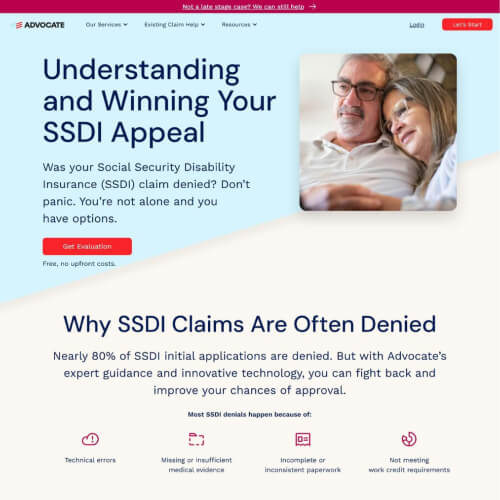
Advocate Landing Page - Appeals
Taking on the task of creating a series of new landing pages for Advocate, a disability claims representative, I created a new page for the appeals process. Utilizing their extensive branding guidelines and incorporating best practices for SEO, UX, and page optimizations I designed and built the pages in Webflow. Careful consideration was used to ensure the target audience was matched and represented. Late stage appeal claims are the main focus of the page. Other site improvements were made as well such as an updated navigation menu.

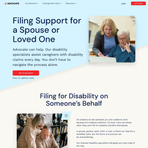
Advocate Landing Page - Filing for a Spouse
This page focusing on filing a claim for your spouse is another landing page using the newly created template. The subject matter is slightly different from the company's main audience of people who are filing for themselves, so more consideration was given for that change.

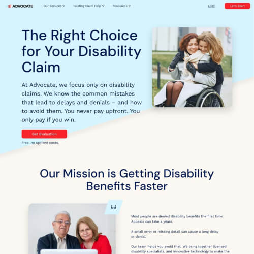
Advocate Landing Page - Why Advocate
Why Advocate is a staple page for the Advocate site using the same newly created landing page template. The goal of this page is more focused on creating trust for the brand rather than focusing exclusively on a single claim issue as other pages do. That doesn't mean there still aren't targeted SEO keywords within the page to make sure the website is still ranking.

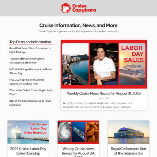
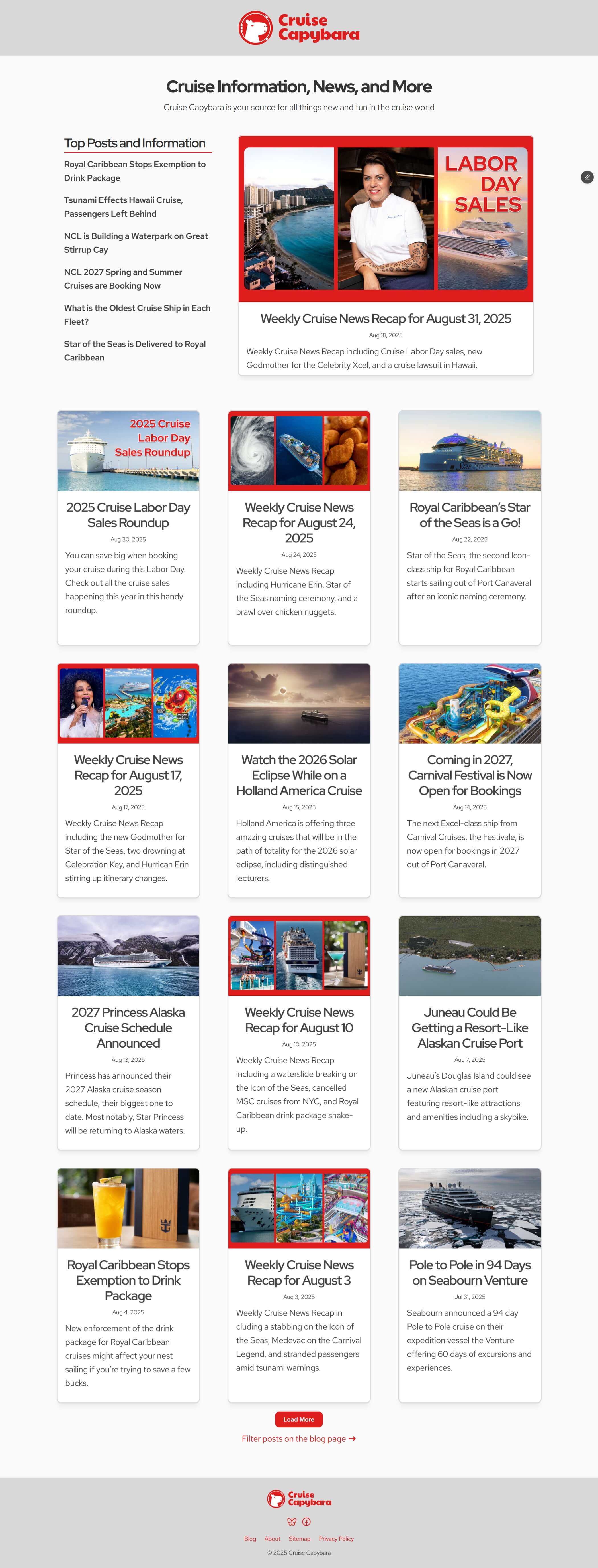
Cruise Capybara - Blog
Cruise Capybara is a travel blog focusing on the cruise industry. The blog contains news updates alongside tips and travel information. The site was created in Framer and utilizes their CMS to maintain and update the blog posts and site structure. I was involved with everything from branding, content creation, and SEO.
Henry Meds, Web Operations, Development, and Design, 2023-2025
- Manage and maintain the front-end marketing website with over 4 million quarterly sessions.
- Created and managed over 115 website A/B tests to optimize CVR.
- Implemented over 20 promotional campaigns.
- Lead a team of talented Designer/Developers.
- Curated and created over 260 new landing pages.
- Implemented SEO improvements through the website improving crawl score to 100.
- Maintained the overall health of the website with constant monitoring and testing.
- Managed a CMS transition from WordPress to Framer.
Cerebral, Landing Page Designer/Developer, 2022-2023
- Designed and built over 50 landing pages with tailored specifications for each marketing goal.
- Successfully identified and created a new template landing page experience generating over 5% better performance across the broader marketing channel.
- Designed and ran over 20 A/B tests to improve performance of landing pages.
- Analyzed website data to identify new target audiences and built experiences around these findings with new pages performing 2-8% higher than the compared pages.
- Designed and built over 30 new web components that templatized the web page creation process creating a faster creation and update workflow.
- Audited and cleaned up the landing page domain by removing 200+ antiquated pages.
Cerebral Insomnia Landing Page
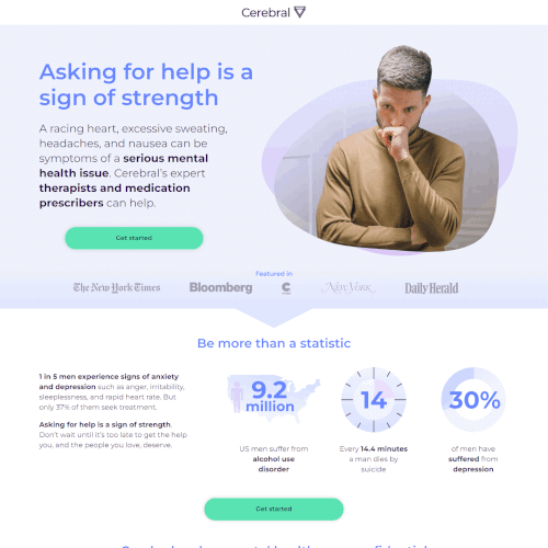
After an extensive audience analysis on our landing pages it was identified that Cerebral had the potential to capture more of the male audience base. We did a deep dive into what our services offered this audience and how we could present a landing page to them. We ultimately came up with two personas and built two pages targeting these persons. After a few weeks in A/B testing this persona based on those currently going through a crisis won out with better performance. I was also able to use some of the same photography in a set of social media ads so that the imagery of the ad matched that of the landing page.

Cerebral Value Landing Page
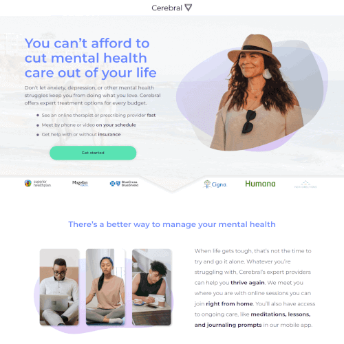
In looking at the performance of key words used in our search advertising we noticed that value based terminology was becoming more successful. Taking that cue we created a page based around the value Cerebral offered pushing our insurance coverage forward above the fold. The result was a very successful landing page that we were able to place in different channels. This screenshot is the culmination of a few A/B tests on layout, style, and copy where we took the winning results to improve the page even more.

Cerebral Value Landing Page
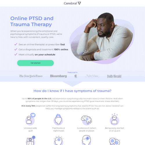
Cerebral already had a PTSD landing page with good performance but we hypothesized that we could improve it with a more targeted landing page. We came up with a newer style and with more comprehensive information on the page. After a few weeks we noticed that we had two audiences coming to the page, one was middle-age women and the other were men. The original page had a younger woman above the fold in its imagery so we updated the image and then duplicated the page and created a male focused version to specifically target that audience. This is the male duplicate page. Ultimately the newer pages performed better.

Cerebral Insomnia Landing Page
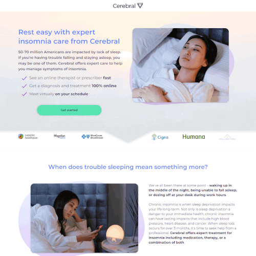
Combing through some more of our performance data we saw that there was an opportunity to market to insomnia and sleep deprivation audiences. I created this page based on successful components of other pages such as having more diverse imagery on the page. We launched this page against our generic landing page and saw an immediate increase in our conversion rates within the audience.

CA.Graphics, Owner/Creative, 2021-Current
- Built an ecommerce site on Webflow and Etsy with over 40 products and growing.
- Created over 20 designs across multiple product lines.
- Set up a drop shipping workflow on two storefronts.
Viz.ai, Senior Designer, 2019-2021
- Migrated the company website to Webflow, recreating the entire experience with over 20 pages and unblocking new content creation from a resource bottleneck.
- Updated the branding identity for the company and revitalized their web experience to increase web generated leads by over 5%.
- Designed and built a new navigation menu with a prominent CTA experience increasing leads by 2-4%.
- Built several custom coded email templates in Salesforce that require half the production time of the previous email workflow.
- Created a new web experience for the security division pioneering a new approval workflow reducing manual approval time by 75%.
Viz.ai About Web Page
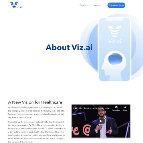
When Viz.ai went through a website migration to Webflow they took the opportunity to restyle and rebrand their website. The About Page was retooled as a resource for those interested in the company, potential employees or investors. Highlighting prime achievements and the strong leadership props up the company.

Viz.ai Analytics Web Page
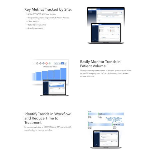
When Viz.ai added a new product to their suite of apps they needed to make a webpage that their target audience understood. Highlighting the features that hospitals care about, like improving time to care and activity statistics for all hospitals in a system, gives prospective customers the needed information they need to become a marketing qualified lead. Working as a team, marketing was able to create a webpage that captures lead generation successfully.

Viz.ai ICH Email
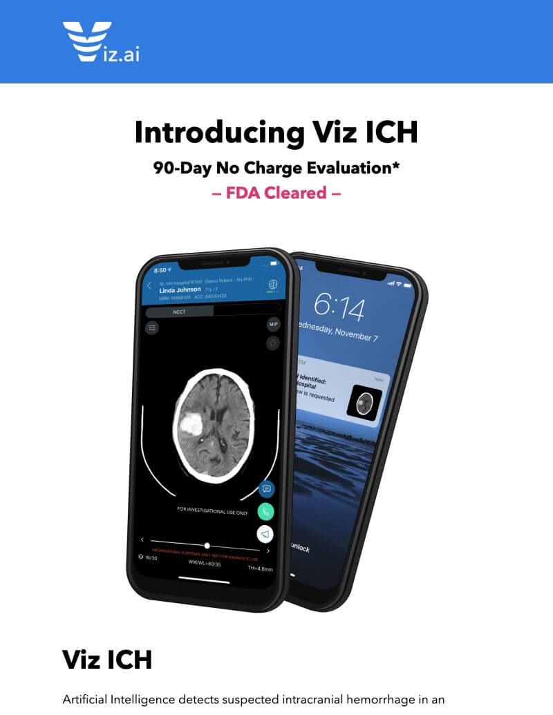
This is an announcement email for Viz.ai's new product, ICH (Intracranial Hemorrhage). The images and text are designed to be visible and readable regardless of dark or light mode. Working with an FDA approved medical device requires the strict following of FDA rules. You'll notice citations for each medical claim and the data on the phone is not real patient data.

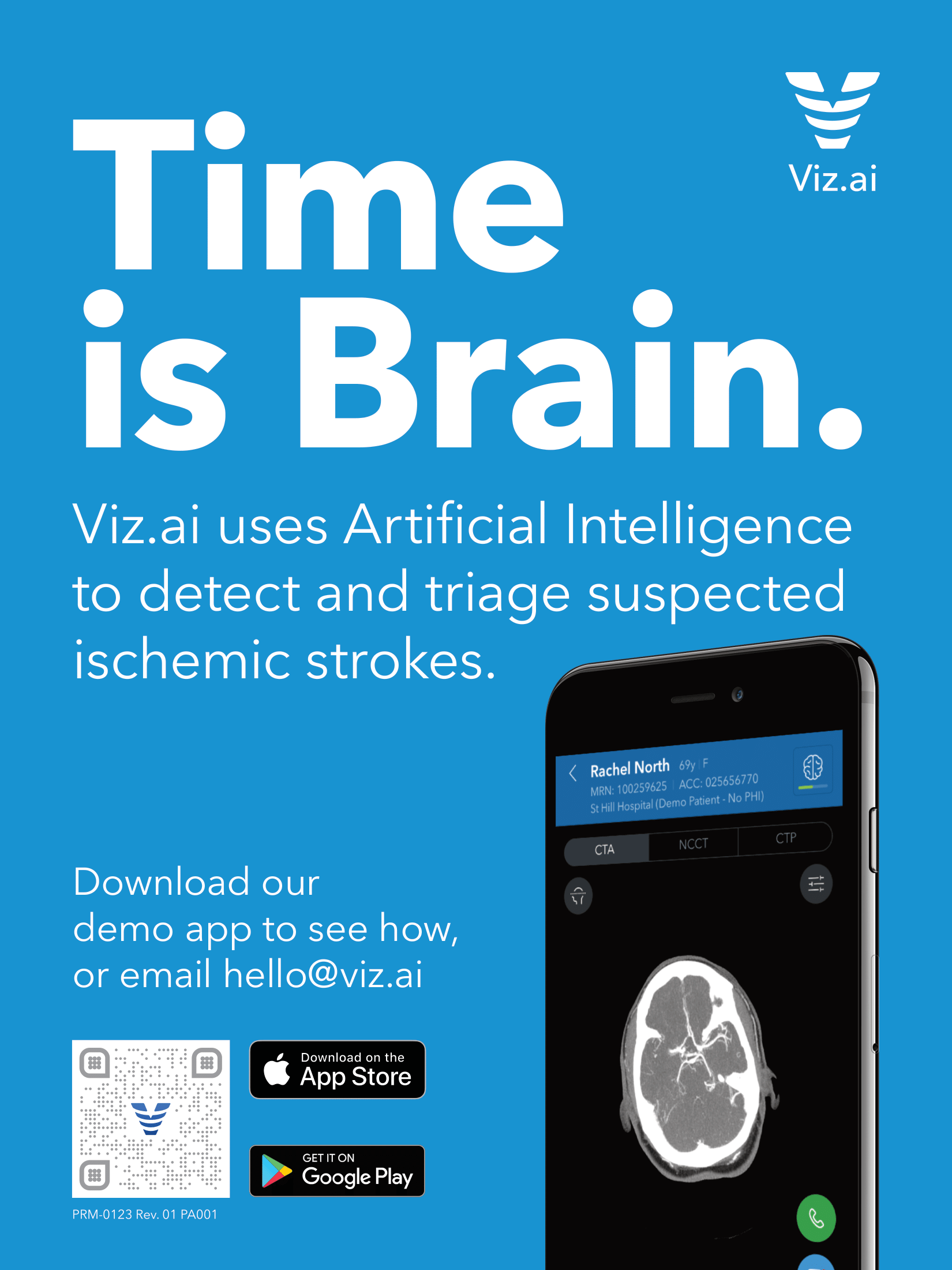
Viz.ai ad in Endovascular Today
This was a print ad placed in Endovascular Today promoting Viz.ai's LVO product (Large Vessel Occlusion). Using the branded Viz.ai blue as the background created a high saturation contrast from the other pages and ads in the magazine. Working with an FDA approved medical device requires the strict following of FDA rules. You'll notice the data on the phone is not real patient data.
Noggin, Web and Graphic Designer, 2018-2019
- Working within HubSpot's HubL markup language I built a new experience for our integration page which filtered over 50 integrations.
- Built 5 new product pages with new HTML animations in HubSpot.
- Design and built a conference registration and information site on HubSpot generating 80% of the attendee leads.
- Created an online responsive conference agenda designed to be filtered by day and conference track.
- Built custom coded email templates in HubSpot cutting email creation time in half.
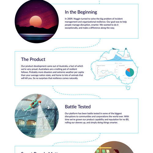
Noggin Security Solution Web Page
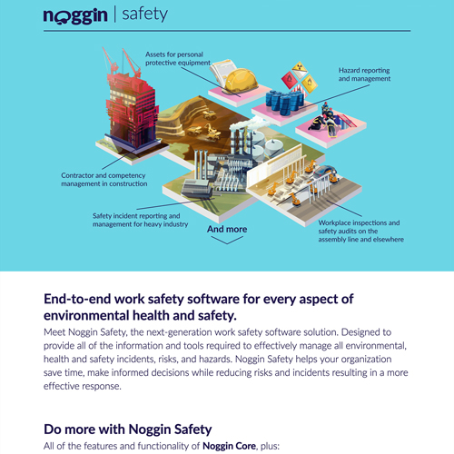
The Security Solution page was created as a series of Noggin Solution pages. The hero image is an HTML animation that activates on mouse over and illustrates the ease of Noggin's wizard. Designed by a talented coworker but built by me. It is in the HubSpot CMS.

Noggin Careers Web Page
The Noggin Careers page features an unobtrusive video hero that features a recruitment video. The video is a smaller edited version of the recruitment video and has no sound. The user can play the video themselves to see the full video. Designed by a talented coworker but built by me. It is in the HubSpot CMS.

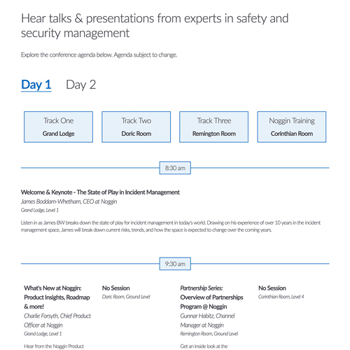
Noggin Conference Agenda
The agenda page from the Noggin UC website. This page was created with day filters so the attendee can toggle between the first or second day of the conference. I made the page completely responsive so an attendee could use it while at the event on their mobile device. I designed and built the page myself. It is in the HubSpot CMS.

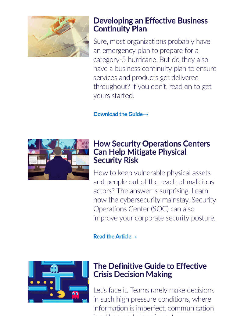
Noggin Crisis Newsletter
The Noggin Newsletter was made in HubSpot with dynamic elements in mind for anybody to customize and use. The header is changeable so it can be a "Crisis Newsletter" or a "Safety Newsletter" simply by changing the text. The Format for additional content can be formatted for 3 or 4 resources. Any image slot can be changed out to use what ever image is needed. HTML, CSS, and HubL was used. This is the 3 resource email.

Poll Everywhere, Designer, 2015-2017
- Designed and custom built over 30 HTML emails.
- Created over a dozen new web pages across multiple target audiences.
- Designed and iterated new plan cards to improve sign up rate by over 3%.
- Assisted in the development of a new branding identity updating over 30 webpages.
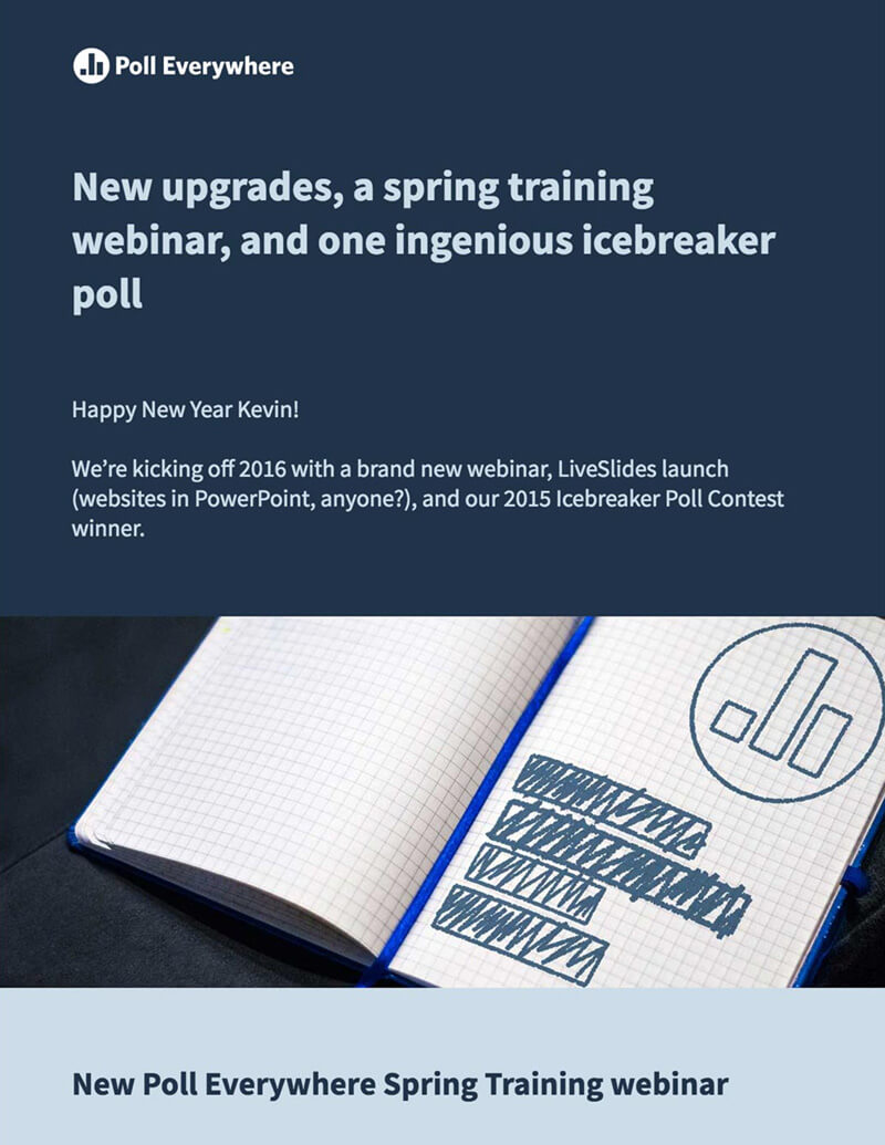
Poll Everywhere Newsletter Primary
The Poll Everywhere Newsletter was made to be a template for a higher impact emails. Each section can be was easily altered to fit what ever content is needed. Animated gifs were used frequently to display moving elements of the software. HTML and CSS were used to hand code this email and was sent out using Mailchimp.

Poll Everywhere Newsletter Variant
This is a variant on the templated Poll Everywhere Newsletter. HTML and CSS were used to hand code this email and was sent out using Mailchimp.

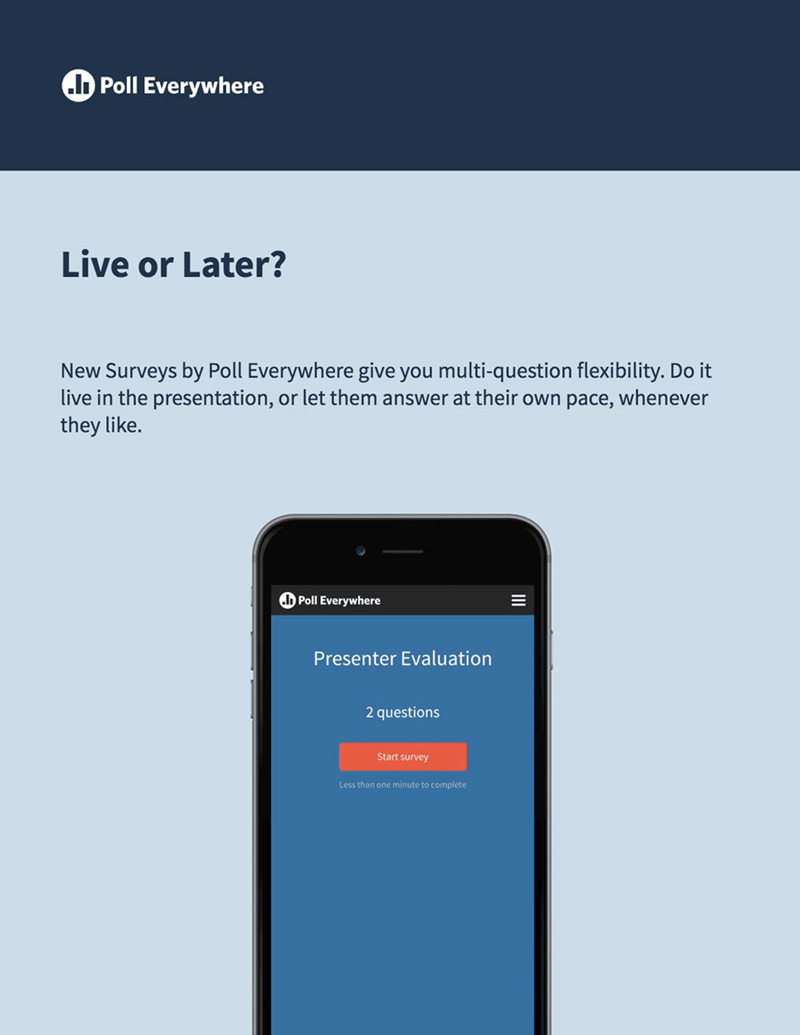
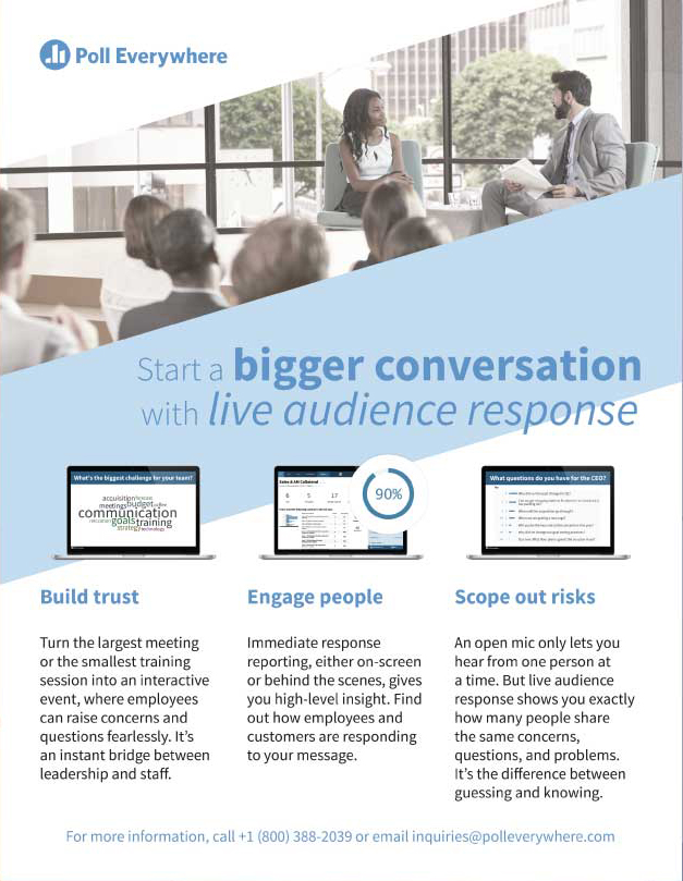
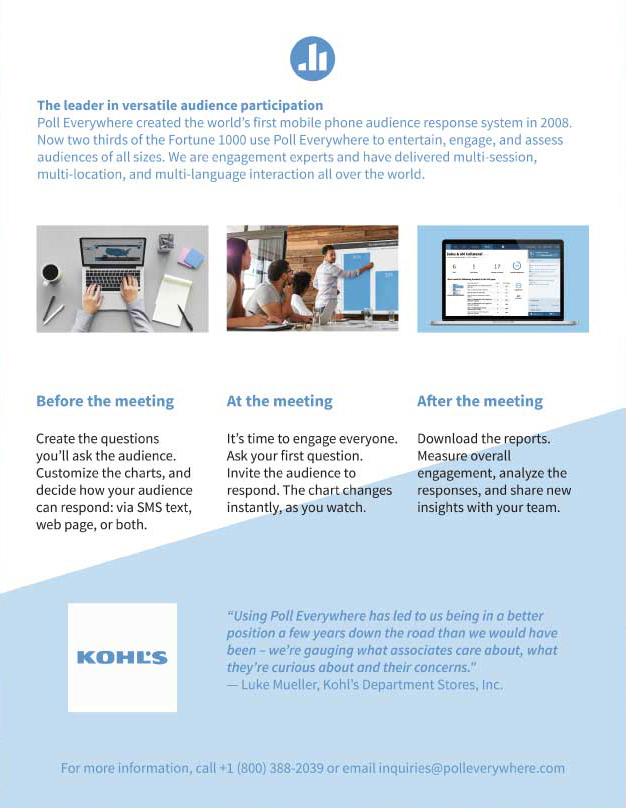
Poll Everywhere Sales Collateral
A generic two-page flyer going over the basic benefits of Poll Everywhere. This was used ad the template for more specific flyers later on.
SAP, Design Intern, 2014-2015
- Assisted in over a dozen Design Thinking workshops reaching over 400 people.
- Created custom HTML animations for web UI components on two projects.
- Scripted, storyboarded, shot, and edited over a dozen videos.
Freelance, Graphic Designer, 2012-2015
- Designed over 50 branding identities for various clients.
- Created over 20 web experiences for various clients.
